I promised myself I’d keep up with the site more, so here’s another post. It’s about disappointment.
I go through phases of creativity. I’m managing to be more creative even though I let gaming (Final Fantasy XIV) suck up a lot of time. It’s easy to log into game and “get stuff done” and feel like I accomplished something, even if it’s virtually. I’m doing better, honest. Which is where the disappointment comes in. I’m out of my usual pads of 9″ x 12″ paper so I’m using 11″ x 15″ pads instead. Not a huge deal, I simply crop the paper down to a more manageable size and work with that. In this case, I’m being lazy and just cutting the pages in half so I have two pieces of 7.5″ x 11″ paper. It’s not quite standard size but meh.
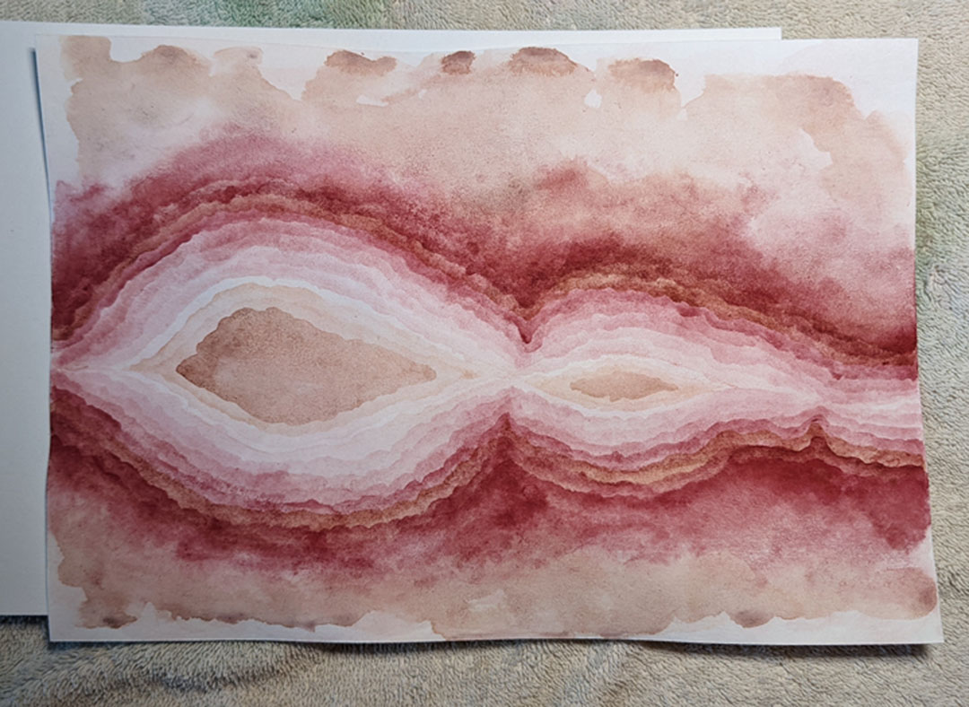
So I have a brand pad that I thought was better quality than it’s turned out to be. At first, I thought it was me and the paint I’m using. I wanted to use a color I don’t usually and picked Dr. Ph. Martin’s Hydrus Indian Red. It’s a nice, earthy color but it dries fast and the dried paint doesn’t rewet at all. Once it’s dried, that’s it. I hate that but knowing it, I deal. This is where I stopped working on the piece in question :
There’s some umber mixed in there but the majority is Indian Red. I initially thought it was just a very granular paint and didn’t lay down smoothly but after a while, I just couldn’t stand how the piece was turning out and I stopped. I’m not usually one to give up on a painting but this just was not what I wanted to see. I started a new painting using the other half of this original piece of paper, this time using greens.
The paper is all wavy because I was lazy and didn’t tape it down to a solid board. But again, you can see the paint is very granular and not going down smoothly. I didn’t think this shade of green (Sap Green, I think, with some Viridian Green) was supposed to be this granular but it’s possible. Again using my Martin’s Hydrus paints. As you can see, I only got a few layers in before I once again gave up because it was just going wrong for me.
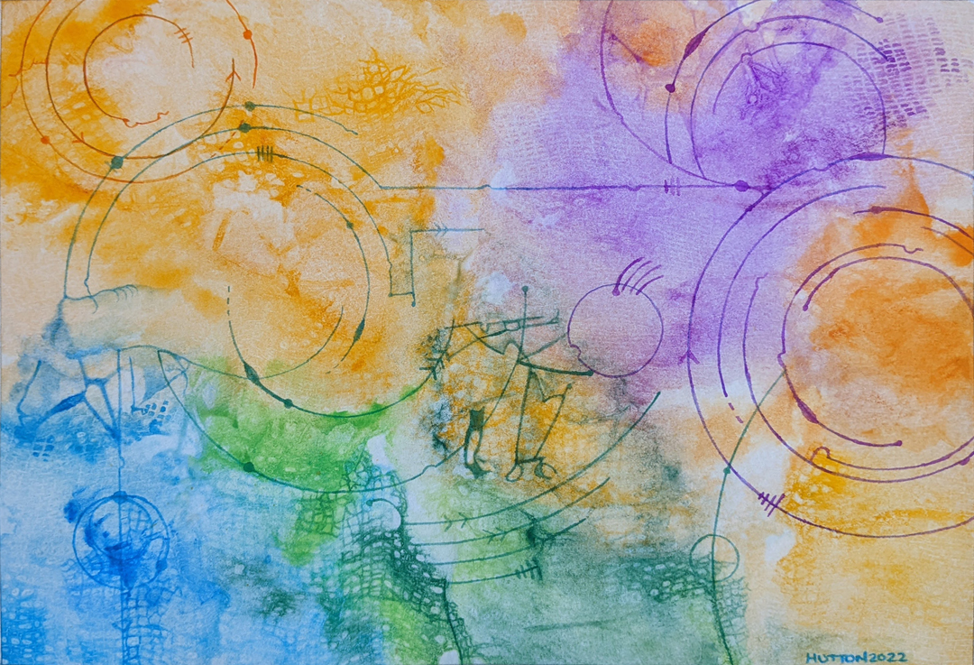
New start time! I cropped a new piece of paper, this time I taped them down to boards and decided to do texture backgrounds first. I wanted a bit of an experiment so I used Sakura Koi pan colors for one piece and W&N Cotman pan colors for the other. Both backgrounds turned out okay, the Sakura one better than the W&N one. The W&N painting was very flat despite me trying to create plenty of texture on it (layers with plastic). Of the two, the Sakura painting worked the best because I didn’t do a lot to it afterwards. This became “Connections” which I posted about in my State of the Art – 2022 January post.
I emphasized the texture in places but you can see in the lines some places where the paint bleeds, which resulted in some of the designs (arrows, crosshatches, solid dots). I didn’t think the paper could be a problem at this point in time. So I moved on to the W&N background and started adding a design there. It was a stylized combination moon and sun and I really liked it. And then I started painting. It wasn’t anything specific at first.
But then I started adding shadows to the blue spaces in the moon. You can also see bleeding color along the edges of the one element above. Those just “happened” as I was painting there. It’s slightly covered up by going over the other areas on white, but at the time I was annoyed that the color was bleeding like that. You can also see in the circular element that the shadow lines are very bleedy as well. Again, not what I wanted. Looking at the red/orange area, there’s a flatness to it that I’ve seen when my paper is oversaturated and the paint has bled through entirely to the back of the page. That’s not the case here though (I checked). Same in this other part of the painting.
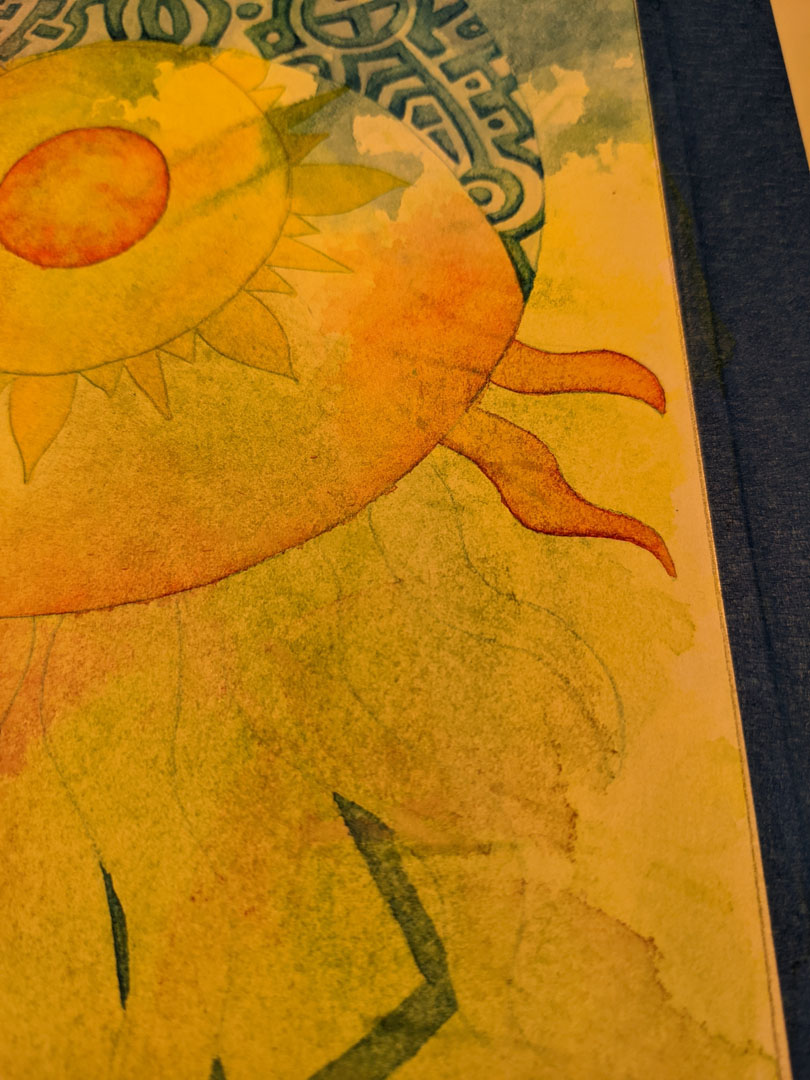
When doing part of the outer ring of the sun, the paper was pilling up slightly and you can really see how the paper looks like it’s been over saturated. There’s also the blue edge there at the bottom – bleedy as all get out. This finally forced me to look at all three recent pieces with different eyes and realize it wasn’t anything I was doing. The watercolor paper was crap. I don’t know if it’s just this pad or what, but now I’m going to need to restock my paper supplies before I make any new paintings. I have no idea what to do with this pad though, it was new so I still have quite a bit of paper left in it. I guess it can be for playing and testing stuff but nothing serious.
Oh well, live and learn.


